This article is going to approach the creation and resolution of problems involving the use of the radar chart in Salesforce Einstein Analitycs.
Einstein Analytics is a solution offered by Salesforce (A customer relationship management platform) with several capabilities: one of them gives users access to a portfolio of analytics apps that can be used as Dashboards to generate key performance indicators (KPIs) based on data stored inside the Salesforce Sales, Service, and Marketing cloud.
Those who are already familiar with the Einstein Analytics platform know that it offers several different pre-built chart solutions to be used in the custom dashboards, including a Radar Chart (also known as a Spider Chart).
Recently, while working on the implementation of one of our clients, we encountered a limitation in the platform that I would consider pretty serious as it would redefine the whole purpose of the Radar Chart. First, let’s review the definition of a Radar Chart:
“Radar charts are a way of comparing several quantitative variables. This makes them useful to see which variables have similar values or whether there are outliers between each variable. They are also useful for seeing which variables score high or low in a data set, making them ideal for displaying performance.“
That’s not exactly what happened to Einstein’s chart as we can see in the snippets below:
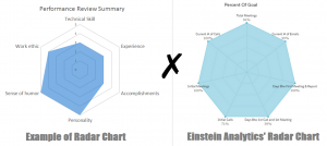
The first image was extracted from the web and is a perfect example of how a Radar Chart should look like while on the right side we have the Einstein Analytic’s Radar Chart with all its variables stretched to the maximum and filling out the whole polygon. Basically, we cannot compare metrics between each other because Einstein is assuming that they all have the same value (even though the variable “Current # of Calls” is reaching 100% while “Initial Calls” is at 71%).
That’s when the challenge really began: we had to come up with a way to make the radar chart work as expected without using code or extreme measures. The solution proposed was to create a second polygon that would set all variables at the maximum value.
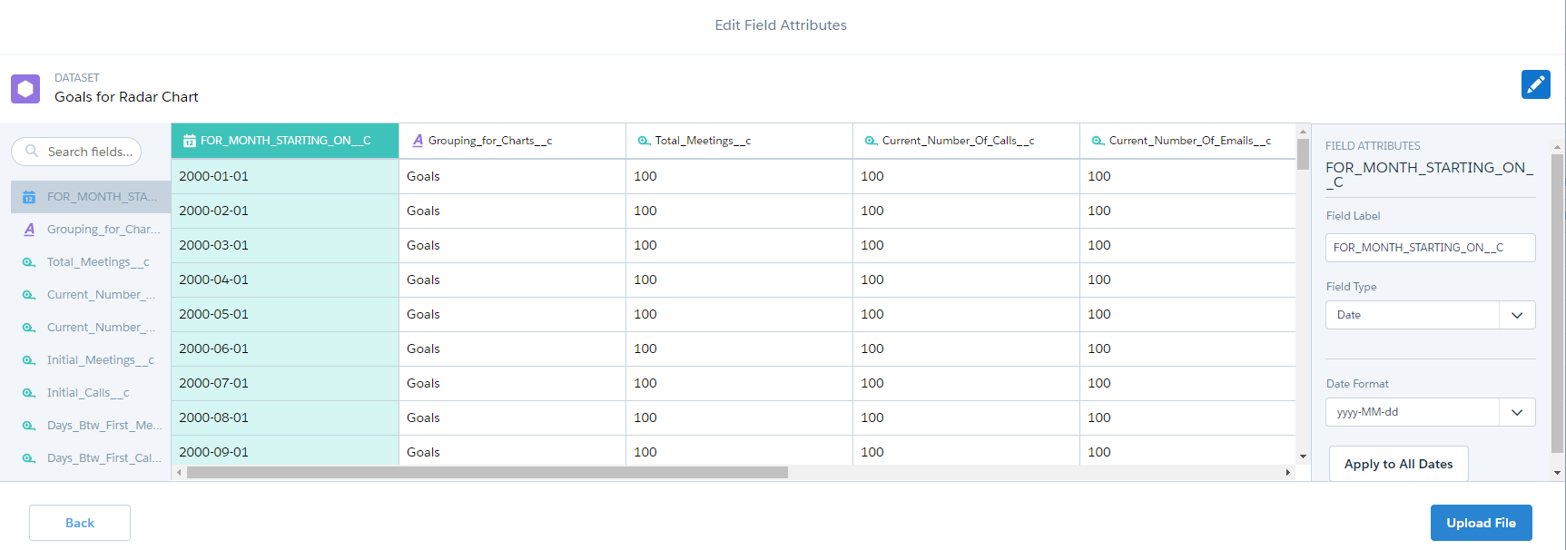
First, we had to create a custom picklist field called “Grouping for Charts” with two values (Actual and Goals). After that, we need to create a custom dataset.
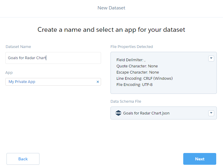
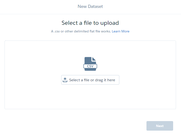
Then, we created a CSV file with the same column names that we had in the radar chart but with all values populated with 100% and uploaded it on the newly created dataset.
Now, we need to merge our original dataset (with the actual data) with the new mock dataset that was just uploaded via CSV. For that, we can create a recipe and merge the fields for both.
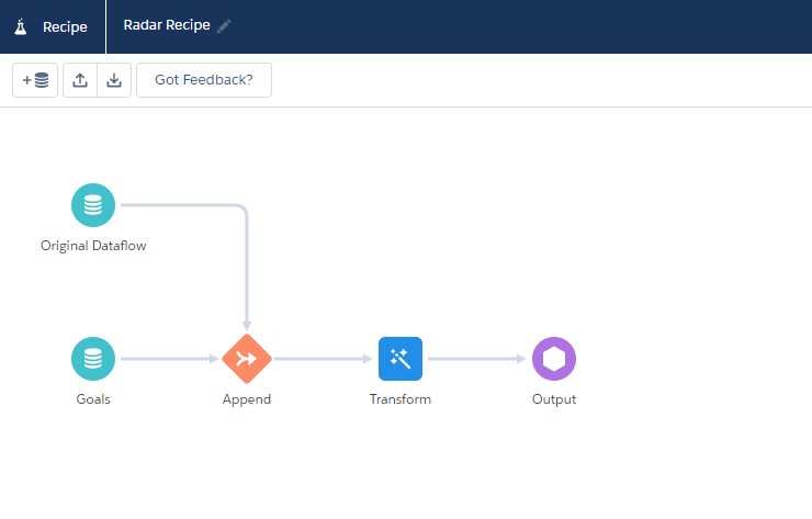
Lastly, we need to create a custom dashboard based on the new merged dataset. There we can create a new Radar Chart and group the data by the new picklist field called “Grouping for Charts”, and here is the final result:
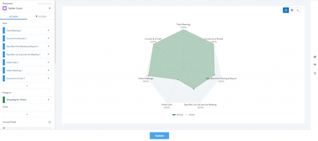
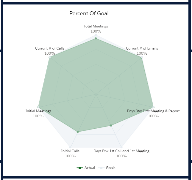
Hint: Associate a light color for the Goals polygon so it won’t overlap the actual data which could also be associated with a dark color. The colors for the polygons can be set inside a custom lens.
Way better now, right? Hopefully, Salesforce will fix this issue in the future and we won’t have to come up with a workaround for such basic functionality.
Stay tuned for more Einstein and Salesforce tips!
Author: Victoria Ventura